DESIGN SYSTEM

My Role
Design System Manager UI Designer Systems Thinker
Platforms
Web
Year
2020-2024
The challenge
We faced difficulties unifying multiple brand-specific design systems into a cohesive framework, while ensuring consistency across components. Onboarding new team members was complicated by the lack of proper documentation, leading to confusion during handoffs. Conflicting brand philosophies often required manual overrides, and integrating Figma updates like auto layouts and variables further added to the complexity.
The opportunity
We identified an opportunity to create a single design system that would serve as the source of truth for collaboration, clarity, knowledge sharing, and responsiveness to industry standards.
The results
The introduction of this design system improved collaboration, reduced project delays, and established a consistent framework for developer handoffs. It also facilitated smoother communication between multiple users, including designers, product managers, and developers, allowing for more efficient problem-solving and project execution.
Design Principles
Design System Overview
We developed a robust and scalable design system based on key principles of accessibility, scalability, collaboration, and consistency. Inspired by the work of design leaders like Nathan Curtis and Brad Frost, this system ensures a seamless user experience across platforms while promoting efficiency and brand coherence.
Accessibility: Ensuring that our designs are usable by everyone, regardless of ability, with a focus on inclusivity.
Scalability: Creating flexible components that grow with the product, ensuring adaptability across different platforms and projects.
Collaboration: Facilitating seamless teamwork between designers and developers, enabling efficient workflows and a shared design language.
Consistency: Establishing a unified visual and functional experience across all platforms, ensuring brand coherence and reliability.
User Interviews
Conducted in-depth interviews with developers, designers, and product managers to gather insights on the real challenges they face.
Findings: We discovered that navigating through the design system was complex for both developers and new designers. Developers also expressed a preference for adding more component-specific colors rather than relying on overrides, highlighting a key area for improvement in customization and accessibility.
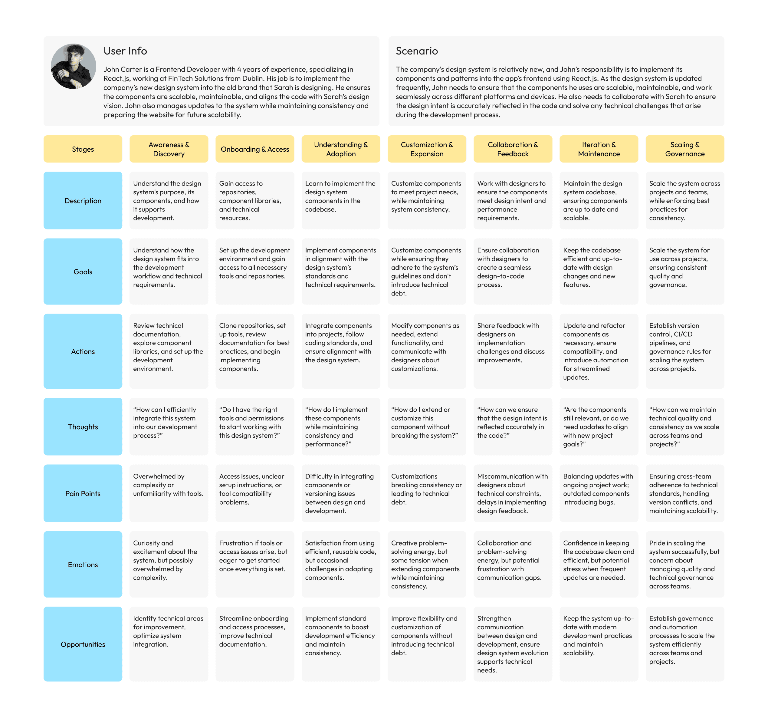
Journey Map (Designer)

Journey Map (Developers)
Market Research
We thoroughly researched industry-leading design systems to understand how they handle scalability and flexibility across brands.
Findings: Our research revealed opportunities to improve by incorporating variables in more dynamic ways, particularly for managing a multi-brand design system. This gave us the insight needed to adapt and streamline the design system for diverse use cases.

Brand-Specific Analysis
We analyzed the existing brand-specific design systems to identify inconsistencies and opportunities for unification.
Findings: We found several inconsistencies in style naming conventions, which could lead to problems when theming across different brands. Addressing these inconsistencies became crucial to ensuring smooth integration and consistent branding.
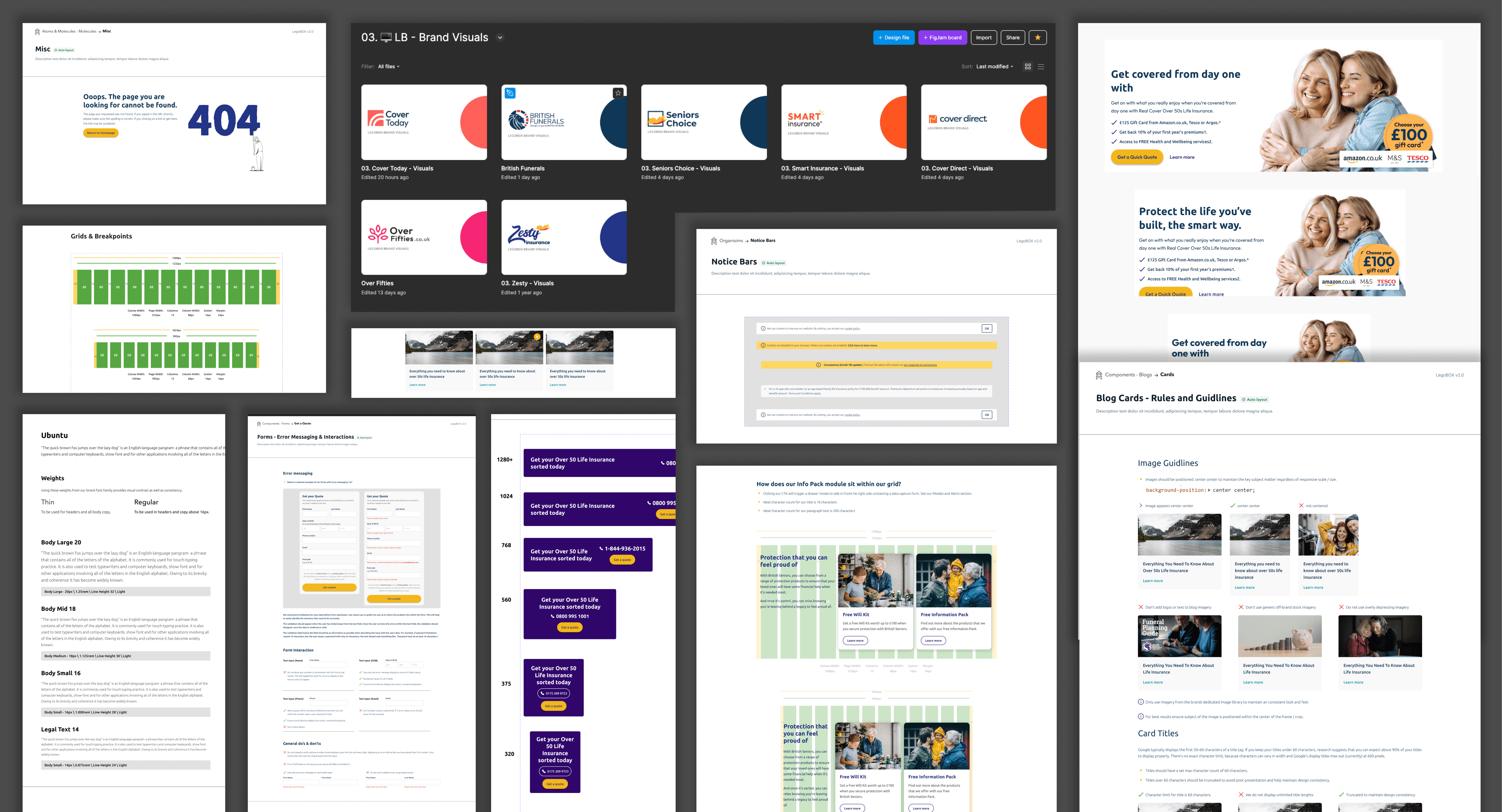
Information Architecture
We meticulously organized and structured the design system to make it user-friendly and scalable.
Findings: We laid out all the information we had and structured the design system carefully, using the Atomic Design methodology. Atoms and Molecules were placed in one file, Organisms in another, and individual pages were assigned to specific components. We also standardized styles to ensure scalability, providing a rough draft of the design system layout from the workshop sessions.
Solutions
Accessibility First: WCAG & A11y Compliance
Our initial focus was on improving accessibility by adhering to WCAG (Web Content Accessibility Guidelines) and implementing A11y standards. This ensured that our design system is inclusive, offering better user experiences for people with disabilities while meeting legal and industry standards.
Improved Auto Layout for Consistency
We enhanced the auto layout using Figma's new min, max, and wrap functionality, giving us greater control over components across multiple screen sizes. This allowed us to create responsive variants all derived from a single master component, simplifying design consistency.
Flexible Color Schemes/Styles
Based on developer feedback, we enhanced the flexibility of our color schemes and styles, improving how they adapt across brands and components, leading to a more cohesive visual system.
Simplified Header Sizing
Initially, we had 45 header styles (h1-h5 for desktop, tablet, and mobile), which became difficult to maintain. We proposed a solution using typographic variables for sizing, reducing the styles to just 15. Font changes are handled through Themer, while size changes can be controlled using number variables, saving significant time in responsive design adjustments.
Component Documentation
We created detailed component documentation for six widely used screen sizes, ensuring clear guidelines and consistency across all design outputs.
Hero Banner Revamp
Our initial hero banner component was overloaded with multiple layers for different brands, complicating responsiveness and development.
We improved this by creating brand-specific hero banner components, giving each brand its own unique look, while simplifying responsiveness and development.
Theming Brands Using Themer
Initially, we manually matched style names to theme brands, but by utilizing Themer, we streamlined the theming process. By combining Themer for font changes and Figma variables for sizing, we achieved both flexibility and efficiency, ensuring the design system adapts without hindering previous designs.
Future Design Recommendations
After extensive research on multi-brand design systems, we discovered the potential of using design tokens. We are now testing token integration with developers using Token Studio, aiming to push JSON files for instant theme updates. This will future-proof our design system, allowing for seamless scalability and flexibility. Two videos highlight the ongoing work in this area.
Results and Learnings
Our focus on accessibility and simplifying components made the design process smoother and faster. By improving color flexibility and centralizing key elements like headers, we ensured better consistency across the system and made it easier for developers to work. Clear documentation helped speed up onboarding and improved collaboration between designers and developers. Simplifying the design system also made it more manageable and reduced the time spent on updates. As a team, we learned that collaboration, clear communication, and focusing on early pain points were crucial to creating an efficient, scalable system that works for everyone involved.
